Nebraska City
Spoiler alert: This campaign led to sales tax revenues increasing 10% year-over-year despite the fact that main artery into town was closed for construction for most of the summer. And now back to waxing poetic. Nebraska City has a lot of things going for it – not that you could tell from their original site. They’re Nebraska’s oldest town; the home of several apple orchards, vineyards and museums; and the epicenter of Arbor Day. So we decided to remind people that the reason settlers first came to Nebraska is still the best reason to visit Nebraska. And since nothing is more Nebraskan than Cornhusker red, that’s what we ran with: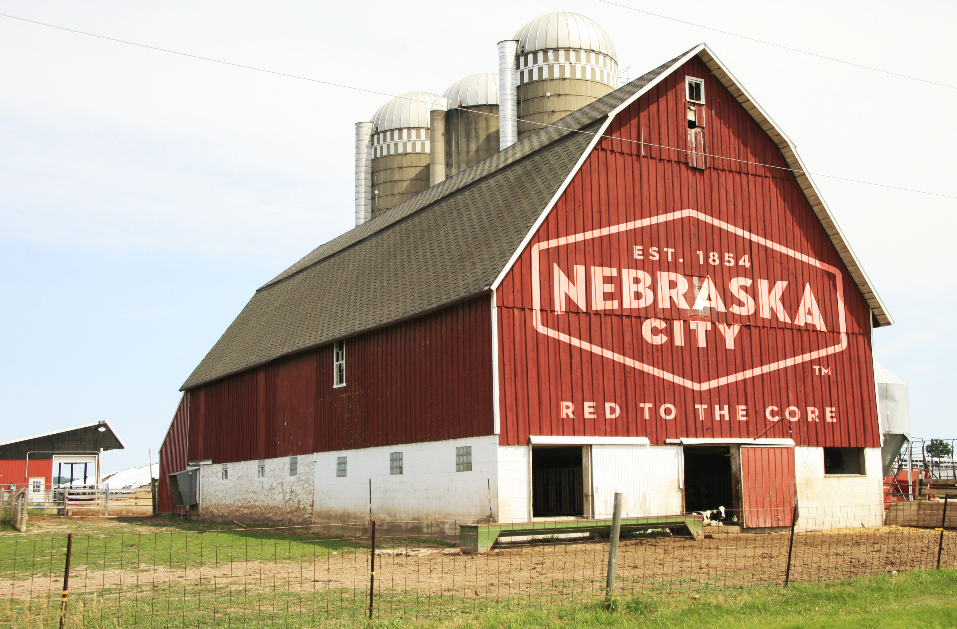
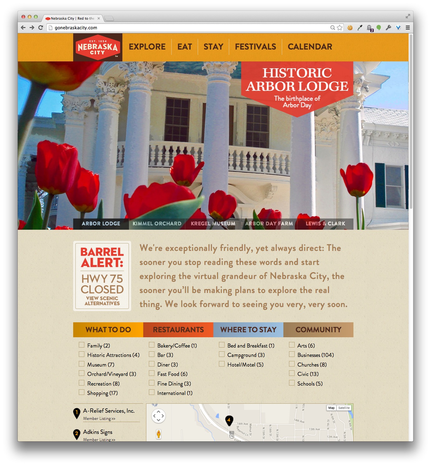
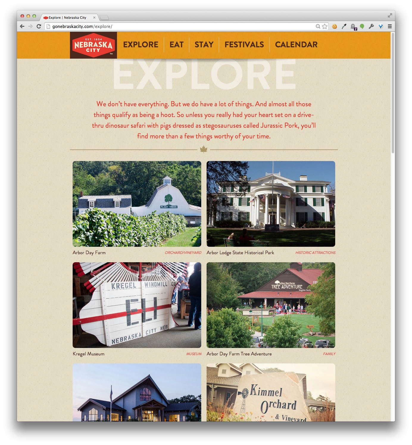
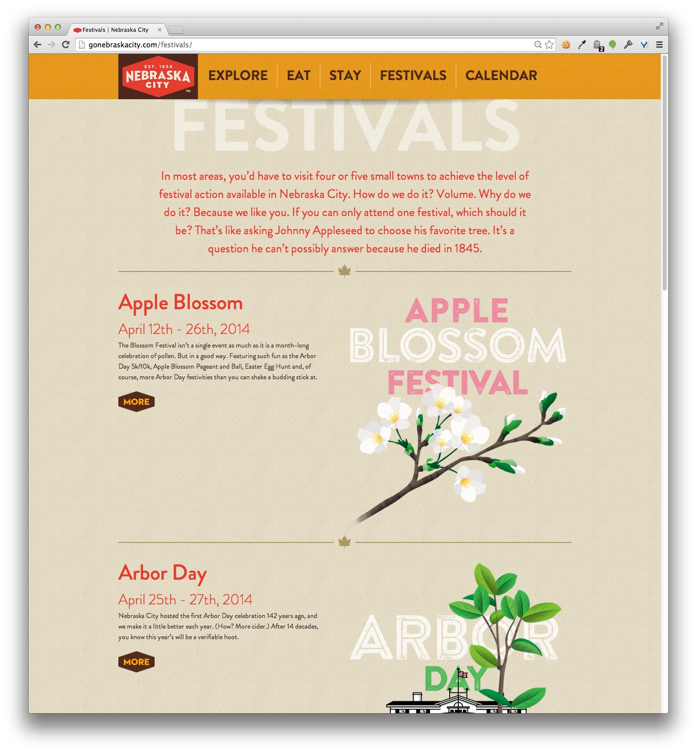
And then on to a little matter known as the website. I‘ll spare you shots of the Flash-tacular old version. The new-and-defintiely-improved site had to not only attract potential visitors, it also had to serve as the chamber’s membership portal. We solved this by giving greater prominence to higher-level members. You want a big photo and picture gallery? Pay up, folks. This involved a lot of back-end work that no one really wants to talk about, but is nonetheless impressive. The site is still live at NebraskaCity.com.
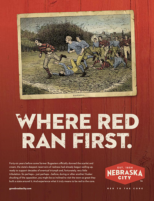
If you’ve bothered to read the copy, you’ve noticed that the tone of voice chosen for Nebraska City is not your typical municipality fare. The goal was to bypass the cliches associated with tourist sites and reject the language they too often use (Find yourself…anywhere but here). It’s bold. It is at times grandiose. It is potentially off-putting. But it is never boring, which most small towns are presumed to be.
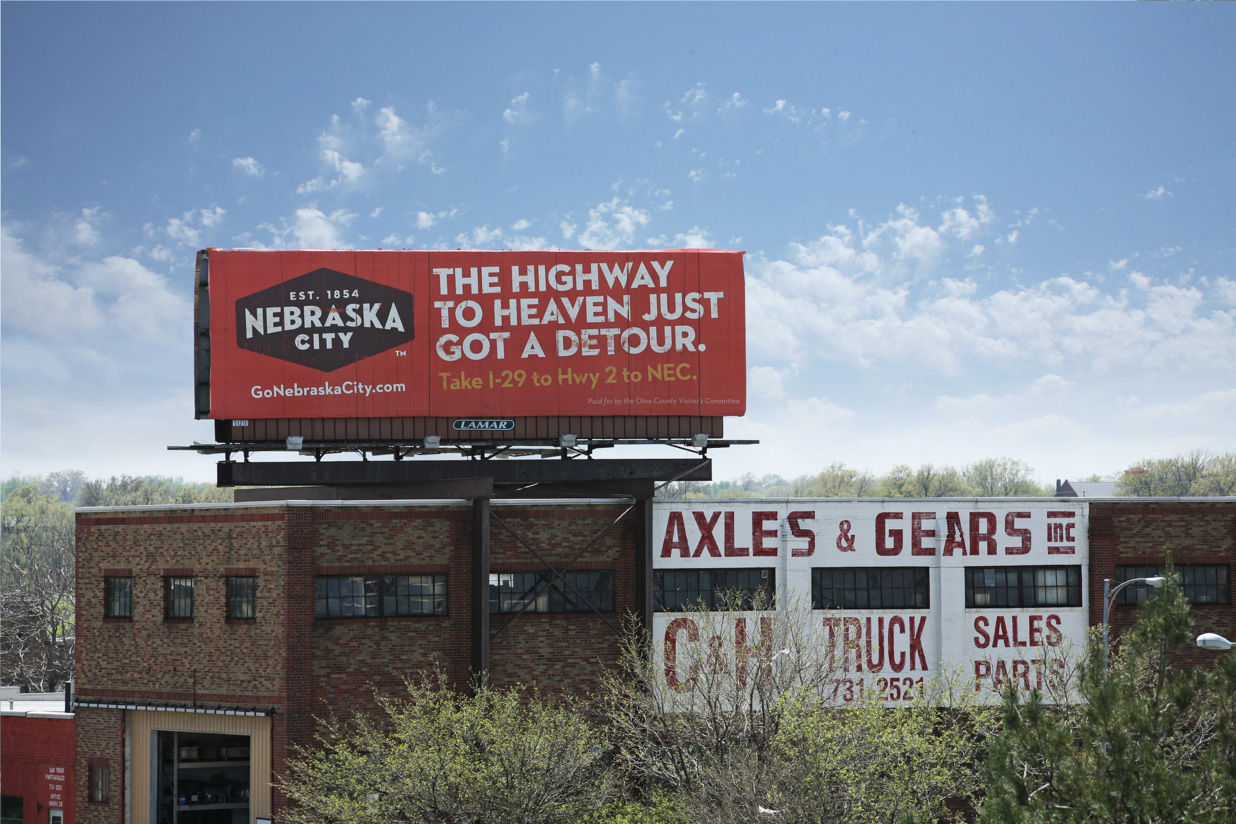
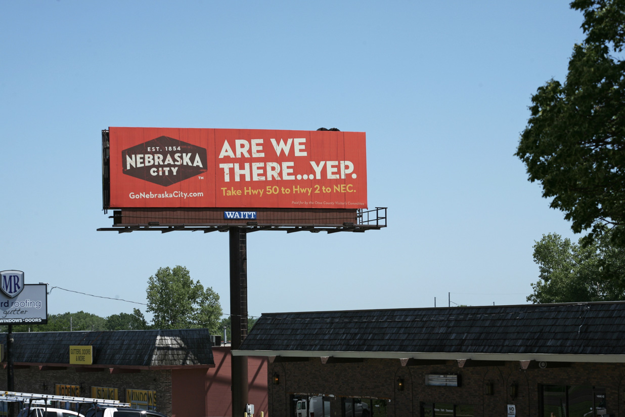
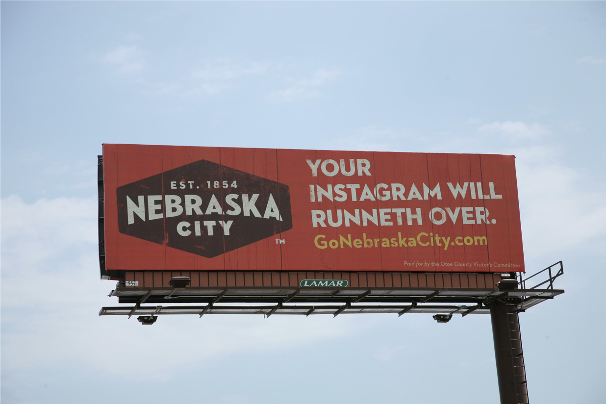
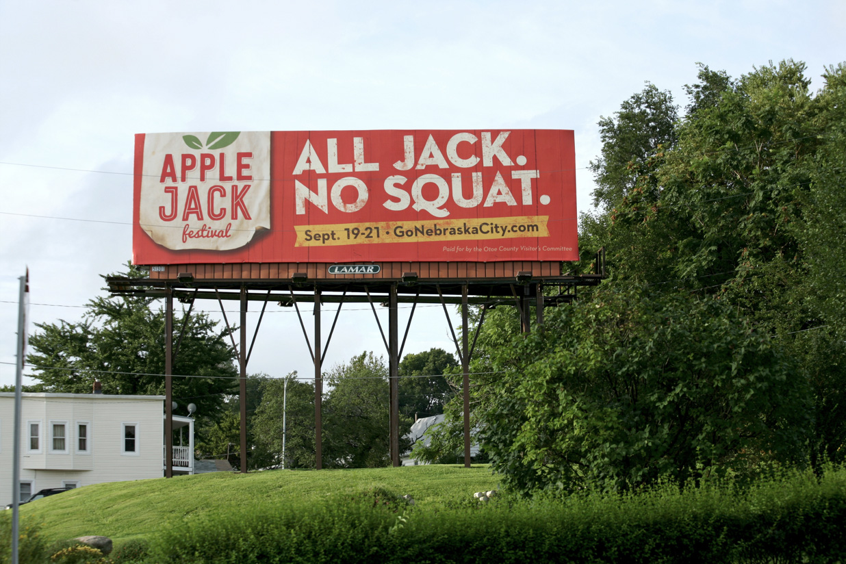
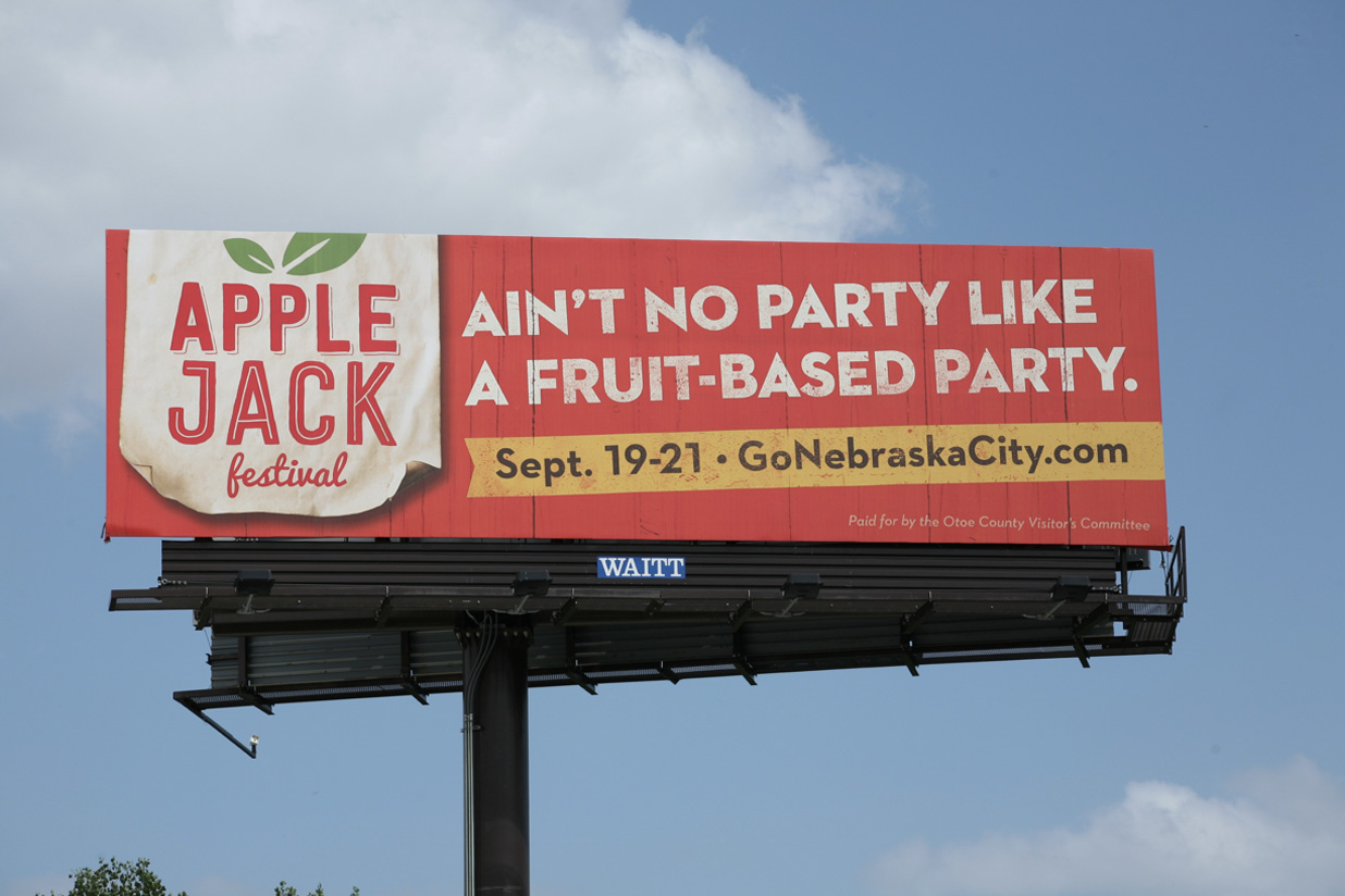
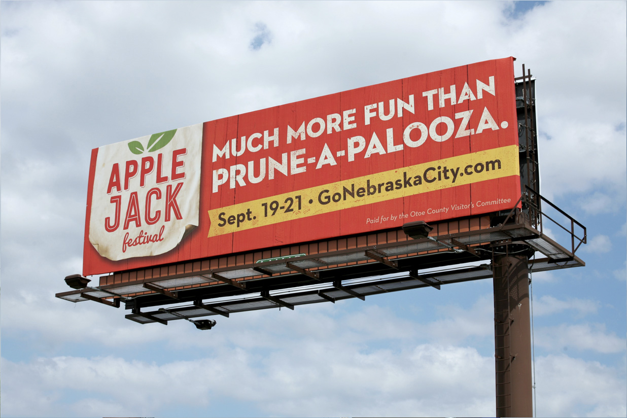
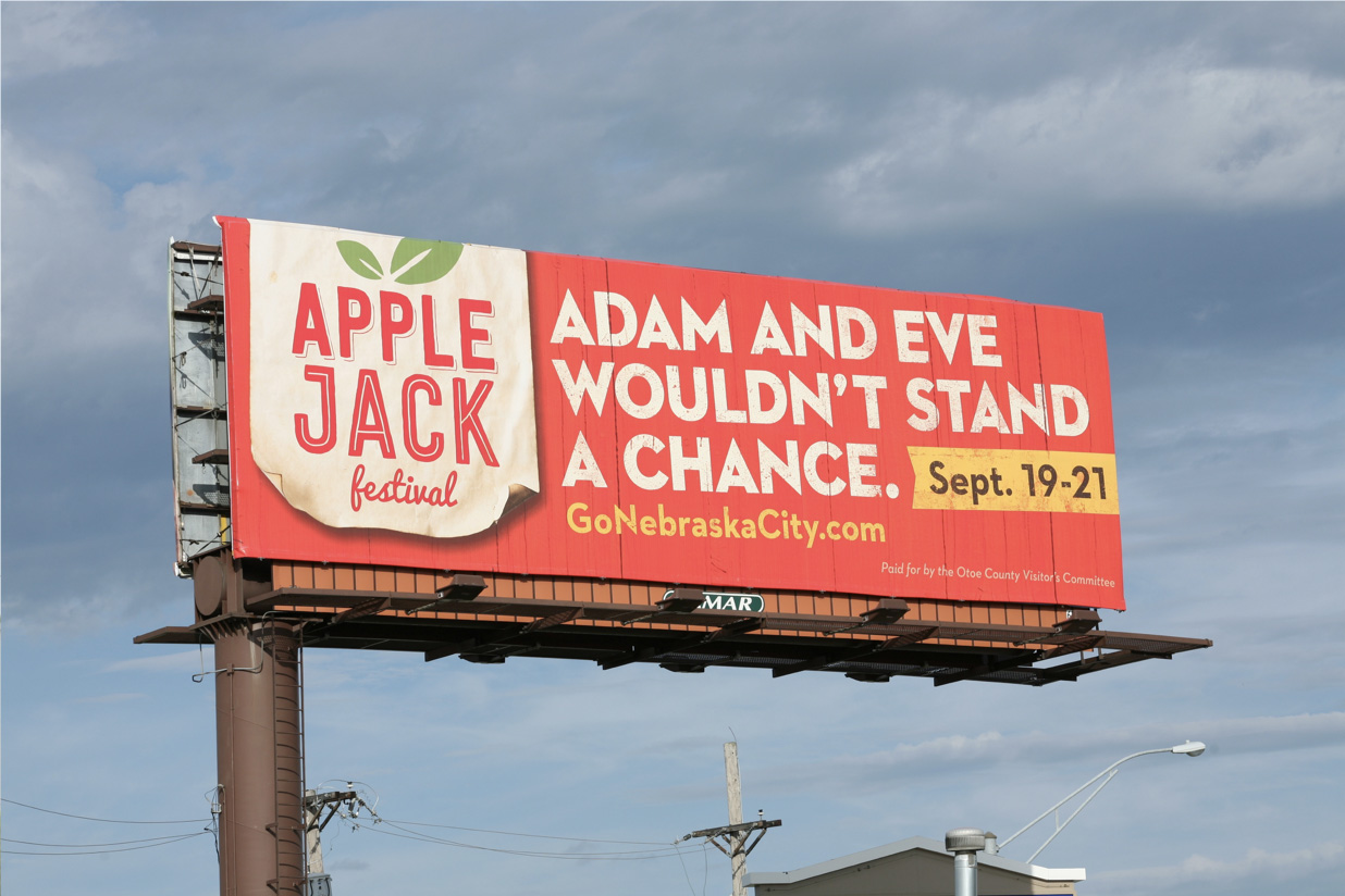
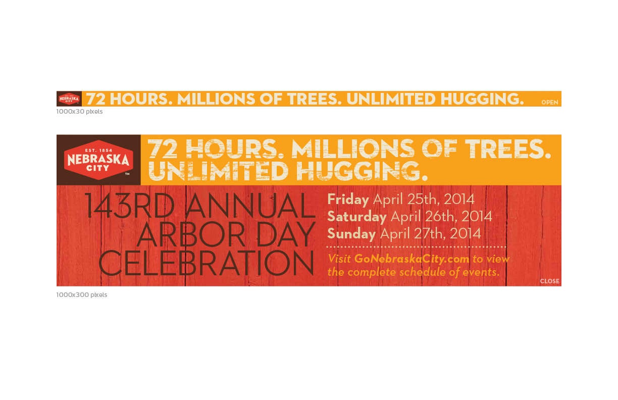
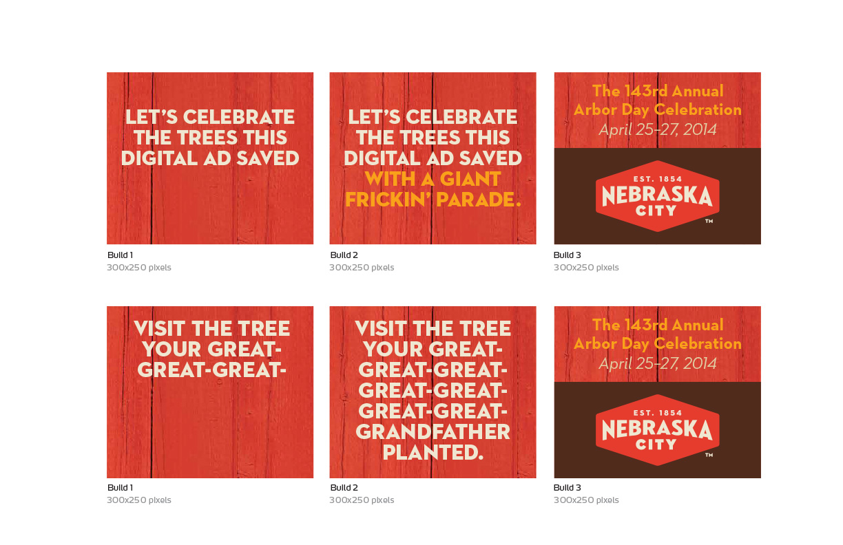
And now for some outdoor and banner ads:
Design: Nate Perry @ Webster
Web development: Rob Heggen @ Webster
